Spoon Cereals

loading...
Leonie Creates illustrated wordmark logo with a badge featuring a graphic of a pencil wrapped around a computer mouse.

Spoon Cereals

Branding & Packaging

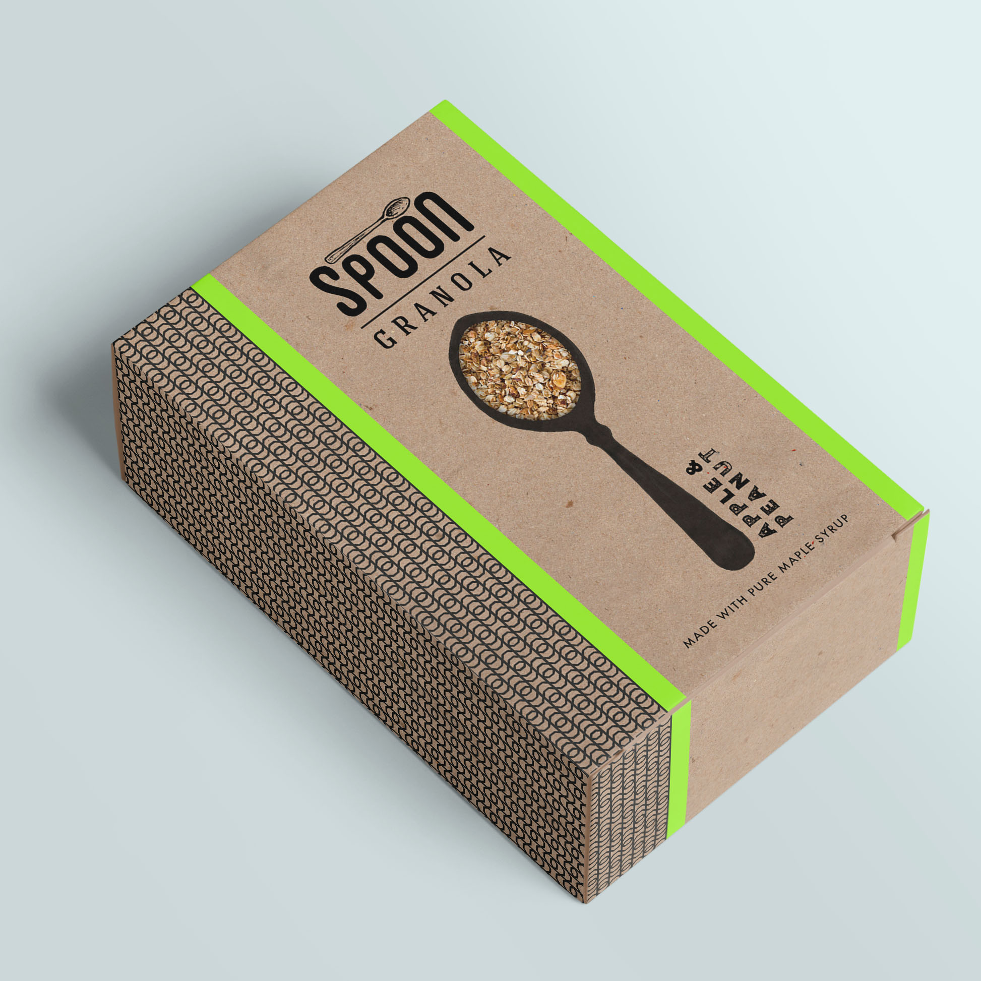
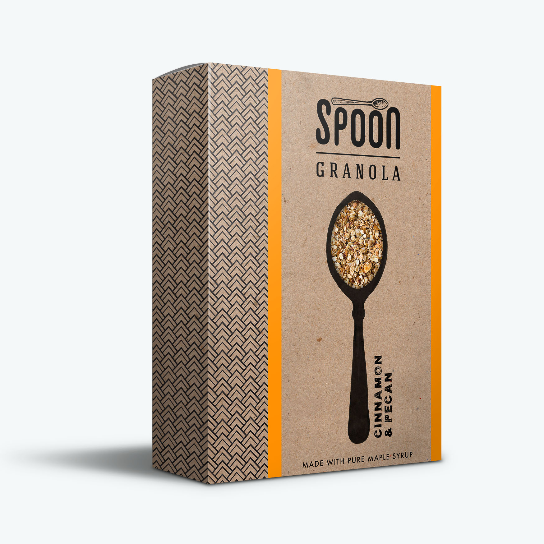
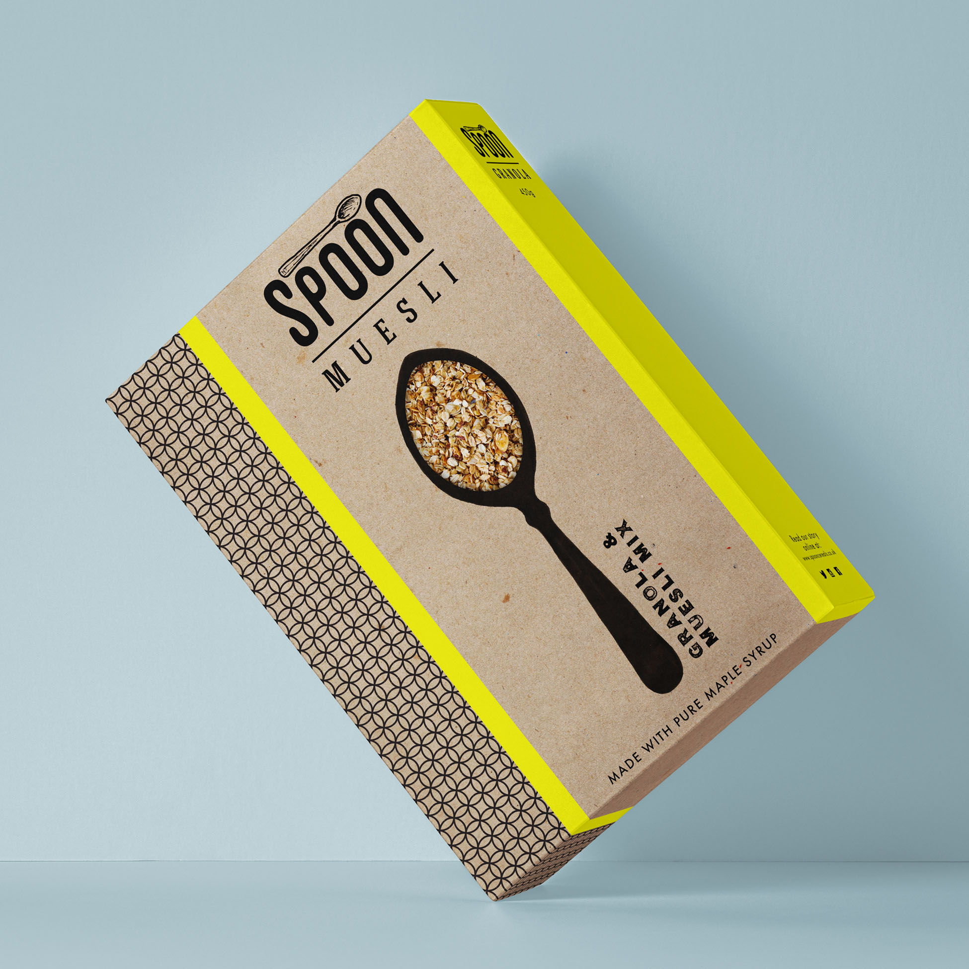
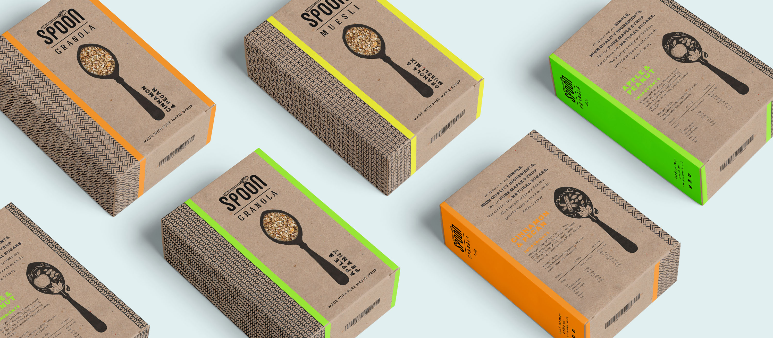
This was a collaborative project from the second year of my uni degree, created with fellow students Clare Phillips and Sandra James-Talbot. A live brief set by Flourish Design Studio from Guildford; our task was to rebrand Spoon Cereals. This involved redesigning the logo, packaging, website, as well as undertaking the appropriate market research, culminating in a professional pitch to Flourish. Ours was chosen as the winning project.

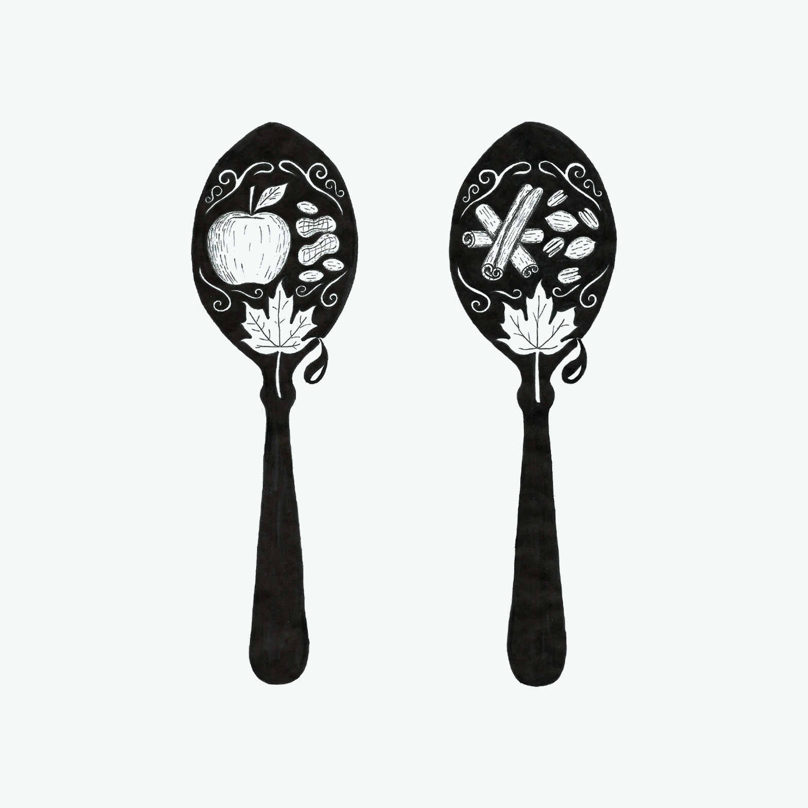
My contribution was the hand drawn logo, the decorative spoon illustration, the layout of the front of the packaging and the first pattern variation.

year

2016

project type

Branding, Packaging Design, Illustration

tools

Photoshop, Illustrator, Staedtler Pigment liners
scroll
Spoon cereal packaging designs in a diagonal grid, showing front and back views. Backs feature product details and illustrated spoon silhouettes with cut-out style ingredient motifs.

Like what you see?

If you’d like my help bringing your project to life with graphic design, just send an email with your project details to:
hello@leoniecreates.co.uk
Icon-style illustration of a white Apple Pencil in a rounded zigzag shape, set against a slate grey background.Icon-style illustration of a slanted slate-coloured computer mouse with a yellow pencil wrapped around it, set against a blue background.Icon-style illustration of a yellow spiral-shaped pencil on a blue background.Icon-style illustration of a slate grey fineliner pen on a light background, with two dots above it forming a smiley face.